
HONEYBIRD
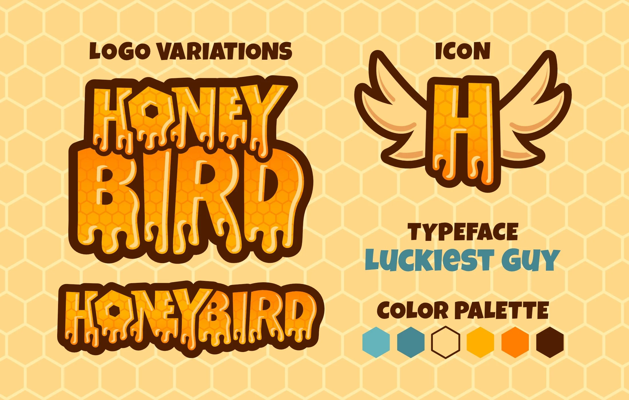
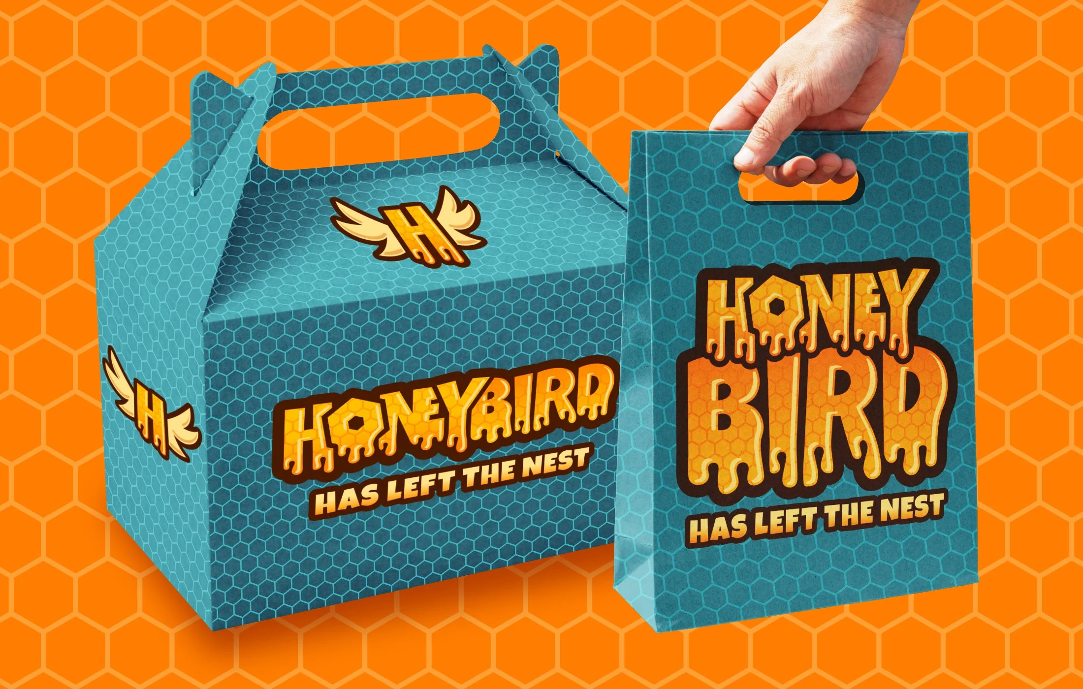
Honeybird is a fried chicken takeaway company built around the combination of crispy chicken and hot honey. To capture the fun, indulgent and memorable feeling of the brand, I used a bold, playful font and customized it to look like honey. I used yellow, orange, and brown colors to represent honey and heat while using blue and white to represent natural, fresh and clean ingredients.
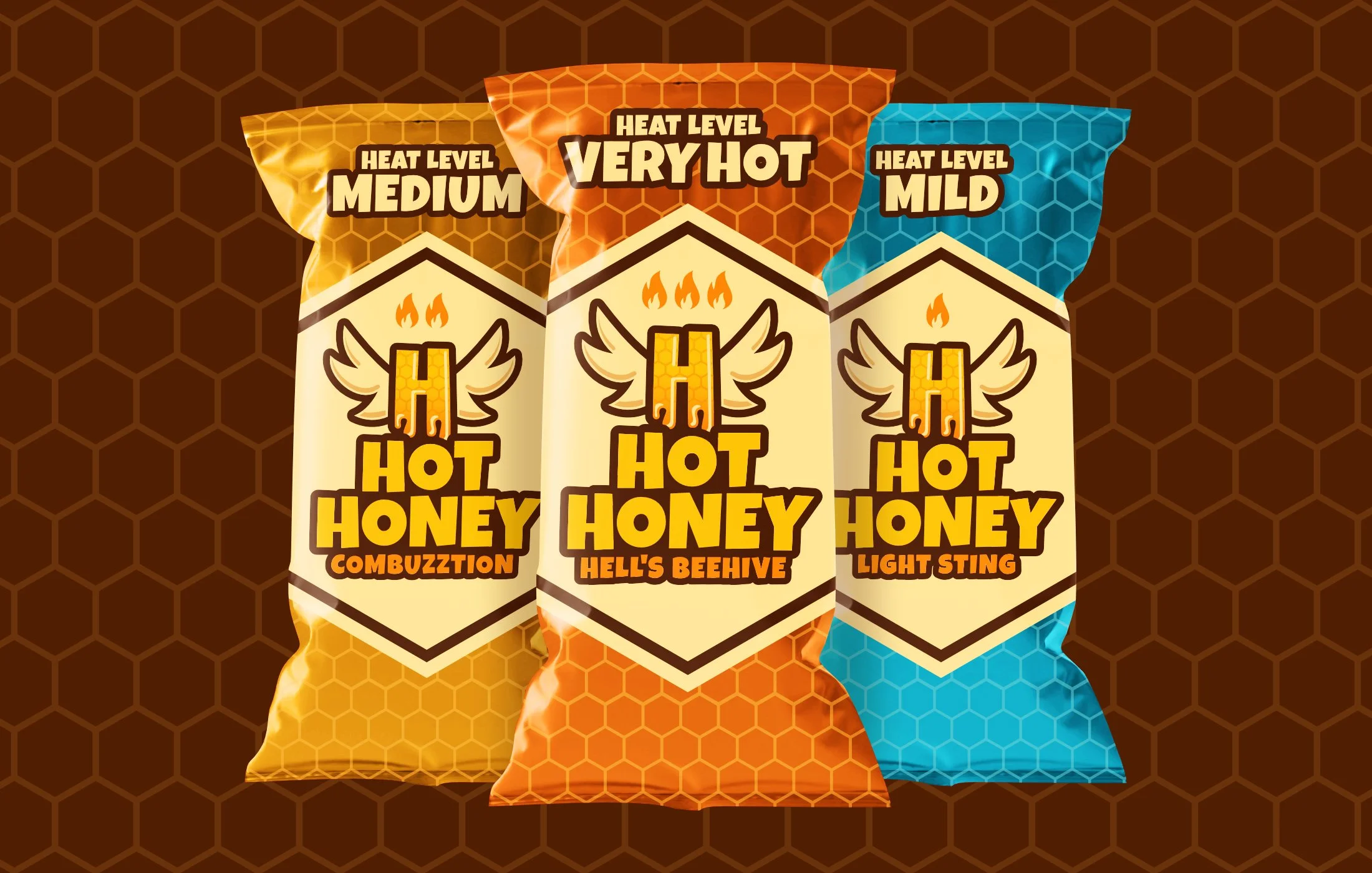
Naming the hot honey sauce pockets was one of the funnest parts of this challenge with “Hell’s Beehive” (the spiciest) being my favorite. I thought humor and playfulness would be a great way attract the younger audience this brand serves.